Hello Factorio players!
We recently launched a new system on our webpage for linking a Factorio website account with a steam account. This will be used from now on to verify that the user making the key request is legitimate, and it should help reduce the amount of fraud we have been seeing on our website. Another feature of this is that now users who purchased the game on steam, can link their accounts and allow them to download the website versions of the game. This is all in preparation for 0.13 where account will be used to access the modding portal and the multiplayer matching server and the authentication service:
Now, when you are playing a multiplayer game and someone joins, the username he has could be anything he would like. This can be obviously used to cause havoc. To solve this, the servers will have an option (on by default) to require authentication by the Factorio website before users can connect. This will be essential for implementing the admin system. The plan of the admin system is quite simple, the player starting the game is admin by default, and he can promote other to admins, kick and ban other people.
The promise to solve the irregular size of the train wagons, mainly the difference between vertical and horizontal size, put a lot of wrinkles on our faces. We had countless discussions with Albert about the possible solutions.
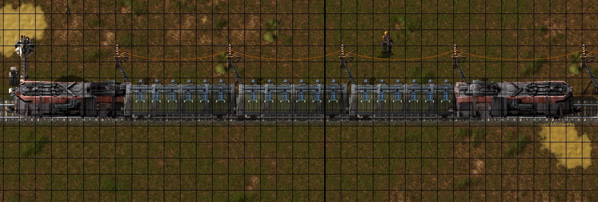
Our goal is to make the vertical and horizontal train stations, to have the same dimensions, something like this:


But the problem is the transition between these two directions. The core of the whole problem is, that the Factorio grid is squares, but the game isn't a top down view. The game uses an dimetric projection at an angle of 45 degrees. This means that the top down view of the Factorio tile is actually a rectangle with a dimensions of 1 by 1.414 (square root of 2 ).
It was probably a mistake to make it this way, if I could go back in time 4 years and give myself advice to not do it this way, I would, but I have no time machine so we have to live with it as it is.
This leads to the problem with trains, when you rotate the train wagon, the vertical variant occupies less tiles, so we compensated for this by making the train tighter in the vertical direction, which results in different lengths of the train stations.

The first solution we thought about, was to just stretch the train secretly as it is rotated. But as the difference is 41%, it would really not be hideable and it would make it look like it was made of rubber.

We were also considering different options, such as a piston in the middle of the train wagons that would extend when it rotates to vertical direction and similar crazy ideas. But nothing really made any sense to us.
The solution came from the idea to use the gap. The inserter wouldn't be able to access the train in the gap, which would be a clear rule that could be easily applied even when the gap is tiny in the horizontal direction.
If we make the length of the wagon 6 and the gap 1, we can make the gap look really tiny in horizontal direction, but extend it in vertical.


These are far from perfect, but with some little adjustments, like a connection rod, and slight stretching , it might actually work, which is a big relief.
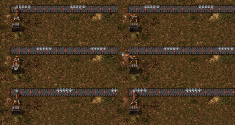
I have been thinking about the loader every other day since the last introduction of the idea. There are so many aspects to it, as it affects core parts of the game, and it can potentially destroy a lot of small optimisation puzzles. The main reason why I wanted the loader, is to lower the gap between transport belts and logistic robots in the late game. The solution that I'm considering now is the Heavy Inserter. It would be just a different kind of inserter, that would apply the stack size bonus also when putting things from/to transport belts. Programming wise this is very simple to do, and it would also not drain the precious time of our graphics department.
Apart the different color/graphics of the inserter it would look as this:

In the meantime, we are still adding nice little improvements to the ui. It is now possible to click the alert icon to open the map to the location of the alert. The map now zooms towards the cursor rather than the center of the screen. It is also possible to right-click and drag to move the map around. The blueprint icon can now use both fluid and circuit (virtual) signal icons.
The production statistics now contain the overall sum. It is now also possible to select individual items in the production/electric statistics, to limit the graph to only show these items. As the graph is now, it doesn't show the production for small scale items well, when the production of the other items is so large.
As always, let us know what you think on our forums.