Since all of us are fixing bugs, there is not much to report. So I will take this opportunity to rant about game design, gameplay design and UI. Please note that these are my (Twinsen) personal opinions and do not necessarily reflect Factorio's direction. Nonetheless it should make for an interesting Friday Facts.
I was always hired to work as a programmer on games (including Factorio), but part of my job was very often to thoroughly design the gameplay elements that I am about to code. I started designing games in 2012, playing around with Unity. Since then I have been the main gameplay designer for 4 small games. During that time I read many articles, some developer blogs, watched random videos, took a course in gamification and played lots and lots of games. I play about 20 mainstream games per year, on different platforms, most of them I finish. One notable mention is World of Warcraft which I played since 2007 (and still actively play at the moment) for a total of almost 7500 hours, during which I was one of the top 0.2% PvE players for a short time. I did some theory crafting, combat analysis and most importantly I tried to understand why its endgame gameplay is able to keep the players engaged for months. Of course there is all the work I did and things I learned so far from Factorio.
This does not make me some big-shot game designer, but there is one conclusion I would always reach: Game design is hard!. The way I see it, programming is easy. If something does not work out, you almost always know what's going wrong and what you need to do to fix it. With game design on the other hand, you can end up spending weeks (or years) implementing your 'amazing' ideas for a game, only to find out that your final game isn't fun or engaging for the general public.
Sometimes when making game design decisions for Factorio, especially when it comes to interaction, we come to a change that can make the game slightly better, but that will not be seen well by the current active players who have played for many hours, since it changes something they got used to. Usually my approach is that Factorio must be the best game no matter what. So if a changes messes up people's bases, or nerfs their favorite weapon, or changes the GUI interactions that players used for 3 years, I'm most of the time the bad guy who says "I don't care about the current players, Factorio has to be a good game from the perspective of new players, who will later become your active players anyway". The game is early access after all.
Hang in there. After this lengthy introduction I'm slowly getting to the point.
We always wanted to make many improvements to both out UI and our UX. But no one was really doing it so we kept postponing it. We hired Norbert as an UX designer, but that didn't work out, and he is unfortunately no longer working with us. So now I am looking on how we can improve the game's UI/UX. To get the discussion started in our team, I made a 63 slide presentation about what we can improve and how. Part of it was about Quickbar, Inventory and Character GUIs, and this is what I will be showing you today.
The basic idea is to change the quickbar from a separate inventory to simply a shortcut bar to the player's main inventory. It will mostly work as the current quickbar, except item slots can only be filters. Some people on the forum are already proposing and discussing this change.

The problem I have with the current quickbar is that most of the time filters are the items I want, while everything else is just random junk put there by the game. If you arrange the quickbar without using filters (consider a new player that does not know about filters yet), it will always get messed up over time.
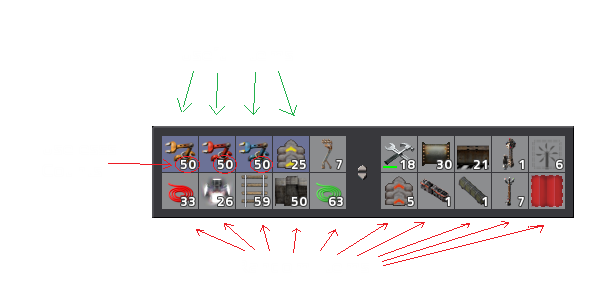

By making them only shortcuts, all this confusion is removed. Shortcuts are created by placing an item in the slot or by clicking an empty slot and selecting what you want there. Clicking the shortcut or pressing the shortcut key will take a full stack of that item into your cursor. For items such as equipment and weapons, clicking the shortcut will equip the item. For usable items, clicking the shortcut will use the item.
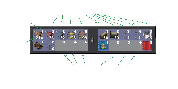
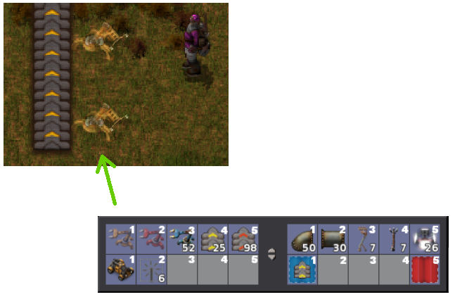
As a bonus, this goes well with another idea: building ghost buildings without having the required item. When you click a shortcut for something you don't have any items of, you grab a ghost of that item in your cursor. Placing the ghost item places a ghost of the building. It's a common situation where you build something and you run out of inserters. So instead of crafting more or running to the other side of the base to get more, you can place ghosts, continuing to focus on designing what you are building instead of being distracted.
Another use case is making future plans by placing items you are not crafting or you haven't researched yet. Simply make a shortcut for any item you want and you can now easily build ghosts of that building.
The player inventory could also use some improvements. By default, the new player inventory is a sparse inventory you can arrange as you like. Sort and auto-sort buttons will keep the items sorted. Additionally, filters can be used to make specific items go somewhere and to make sure you always have space for them.
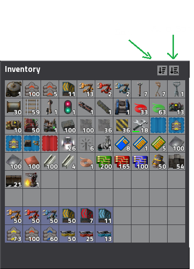
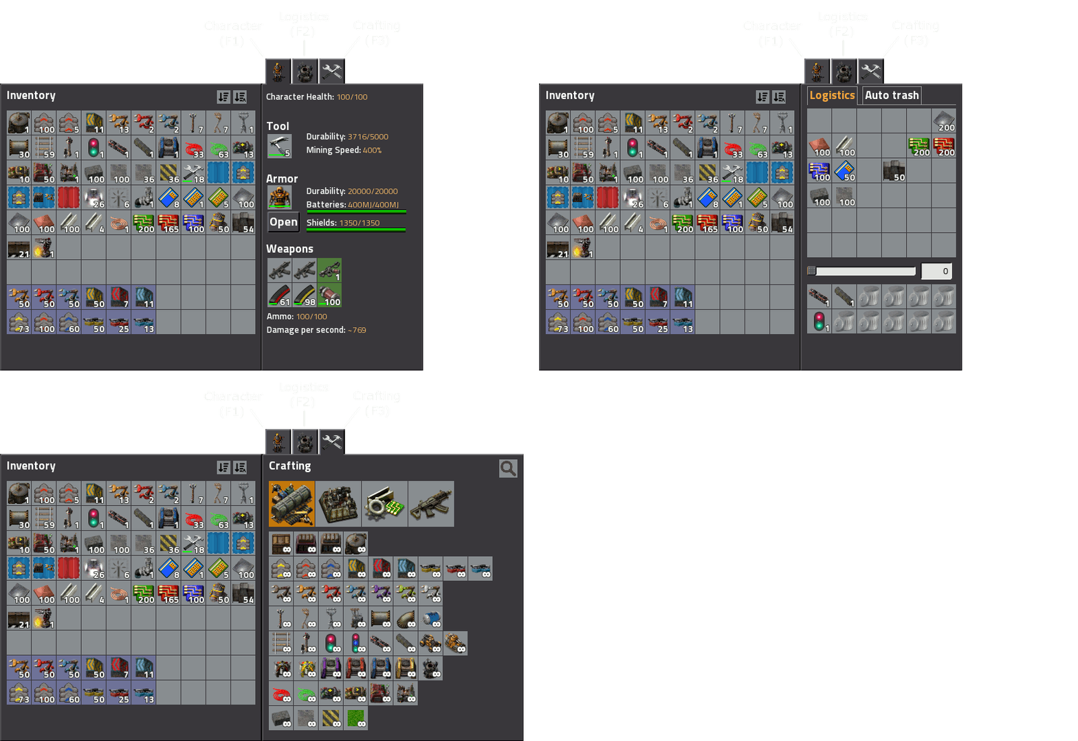
Opening the character screen(using E) will open it with the last tab. To open the character screen in a specific tab, the F1, F2, F3 keys can be used. The equipment inventory from the bottom right will be removed and replaced with just a view of the currently equipped weapon and ammo.
All of these changes come together to solve one of my biggest annoyances with the character screen: inventory transferring. Shift-clicking an item in my inventory transfers it where? To the logistic trash slots? To the quickbar? To the equipment slots? I never know and with the exception of ammo it never seems to go where I want. But with the tabs and the new shortcut bar now it's clear: items go to logistic trash slots if the logistic tab is open, to your character slots if the character tab is open, or to the entity's inventory if an entity is open.
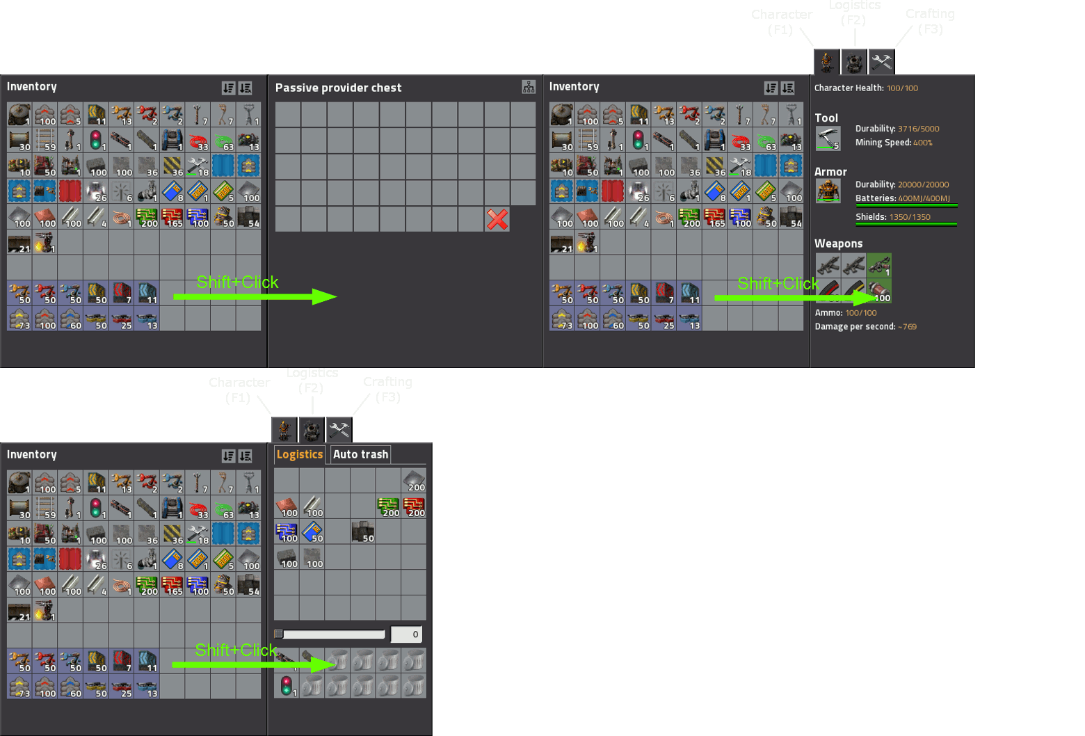
Looking at the big picture, a tiny bit of functionality is lost, but I believe there is a big gain in making the interaction more intuitive. I fear many current players, especially those who won't read this Friday Facts might see this as a bad change, a change for the sake of change. Because I am taking away something they understand and know all the quirks of, to replace it with something that's simplified and new.
This is one of the reasons why improving the UI/UX is so hard. We made it 'okay' so we can maybe improve it later, but now when everyone (including us devs) have used it for so many years, it's hard to see what's wrong with it, because we eventually got used to all the unintuitive things.
As mentioned above, I don't mind being the bad guy, so taking away the hatred of active players who don't like change, do the above changes make Factorio a better game? Let us know what you think.
I'm also curious what you guys think about bout our UI/UX and general game interaction. Should it be improved? Is it good enough? Do you get lost in the menus? Did you have problems when first playing the game?
Comment in our usual topic at the forums.