Hello,
Today we have quite a range of new features and improvements coming in 2.0.
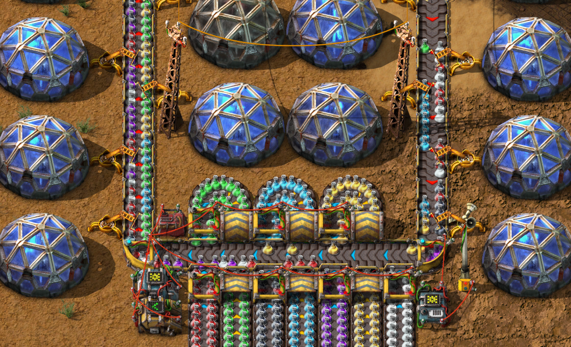
Often times, you want to read the contents of a whole line of belts. Maybe you're doing some sushi set up, or just want to get an accurate gauge on how much stuff you have without buffering to a chest.
The way to do it, is to read every belt, but this has some drawbacks:
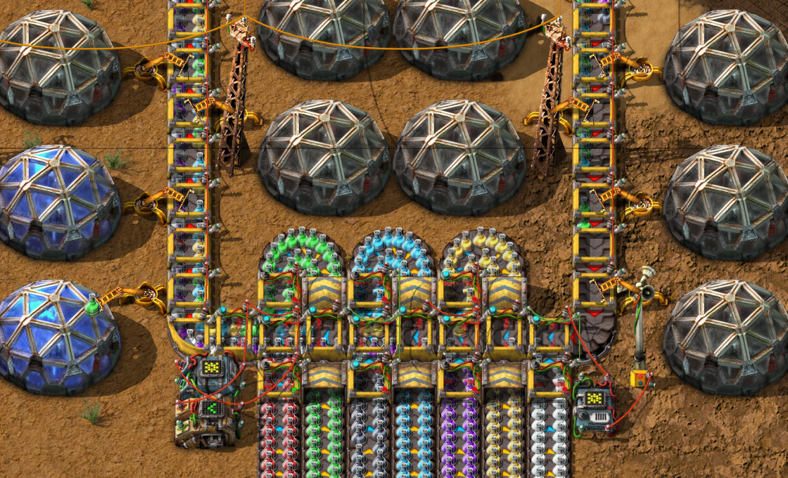
So we decided to make it work nicer. Boskid added a new mode you can choose when selecting the 'Read belt contents' mode.
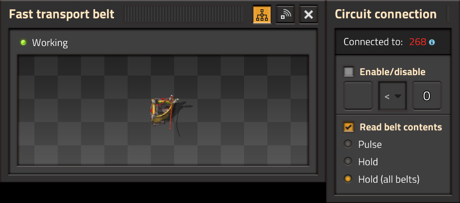
It will read all the belts in the same 'Transport line' as the belt being read. It survives going through underground belts, but is broken by splitters and side-loading onto another belt.
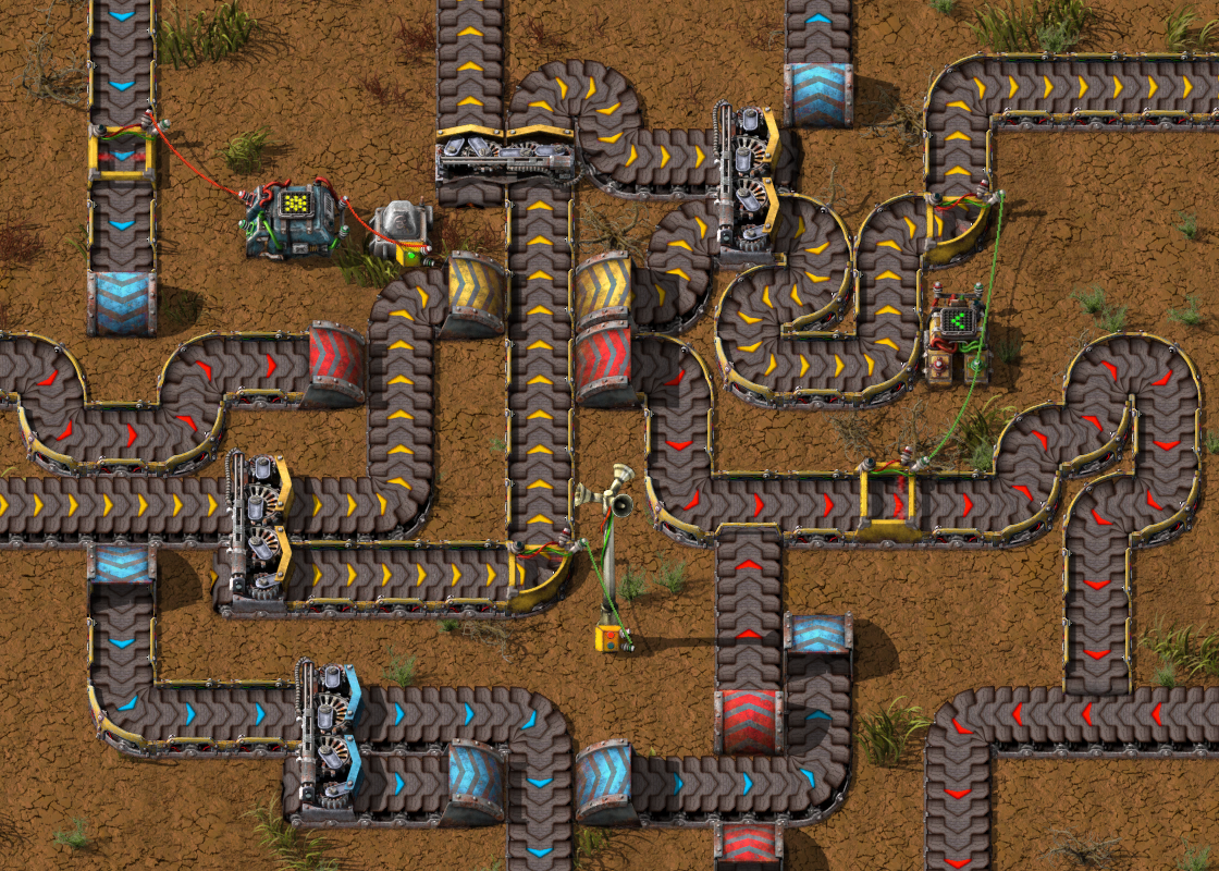
The result is not only way more convenient, but also it looks better with less visual clutter.
In the late-game, you can craft and prepare rockets pretty fast, but there was always a throughput bottleneck: The beautifully crafted animations taking a long time.
We didn't really want to increase the animation speed, as it might look a bit weird. But we figured out a compromise:
These changes mean that the throughput of a single rocket silo is more than doubled. This is also super important for Space age where you send a lot more rockets.
It can be annoying, if you get some train mixed up, and they dump a whole bunch of lubricant into your crude oil inputs. Adding a filter to pumps was technically possible for a long time, we just had to add the GUI.
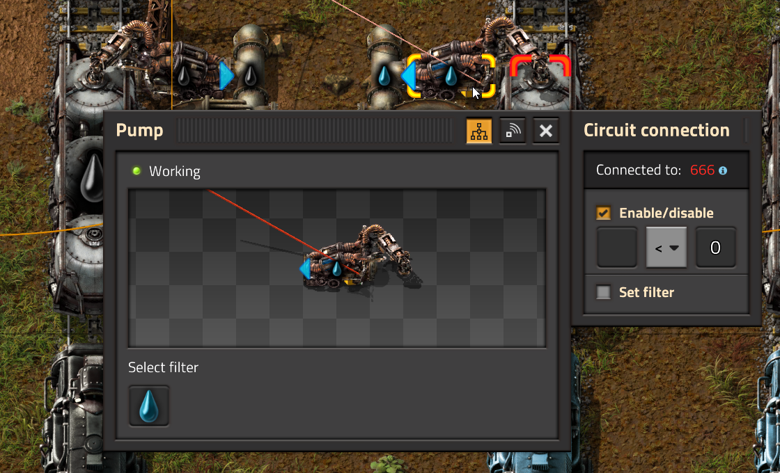
And of course, if we have the fluid filter, it makes sense to also make it part of the circuit network control. We are sure there will be some ingenious designs that will utilise the new power... Sushi pipes anyone?
The Logistic network GUI was added back in 0.15 , and had only cosmetic changes from there onwards.

While functional, the GUI was not used very much, and left a lot to be desired.
The new Trains overview GUI (FFF-364) was a winning formula in my book, so lets just try to copy it:
There was a big problem I was avoiding, which is the network selection. The dropdown solution is bad for a few reasons:
Here I tried to tackle the network selection. The first step was to change from a drop down, to a list. Instantly better. The second step was to add the icon in front to differentiate the mobile and roboport networks. So we're getting somewhere.
But the biggest problem is still identifying the networks. My conclusion was that basically the only way to identify a network is by looking at it.
So I added the 'Selected network' minimap. This starts to get there, I can quickly go through the networks on the list, and visually identify the networks with the minimap.
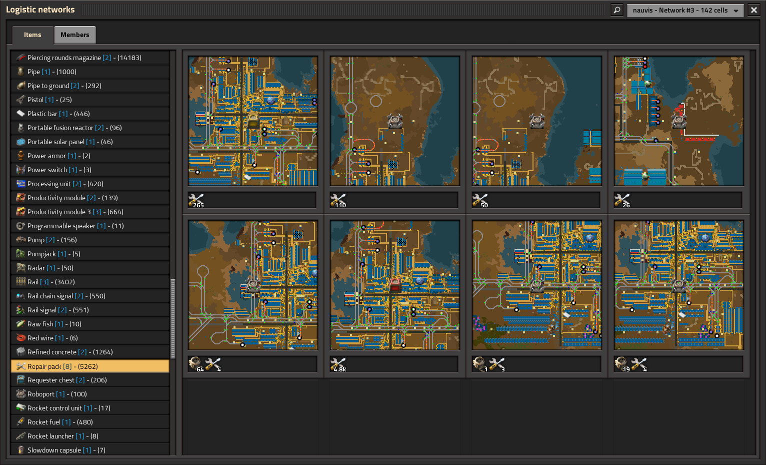
However, the GUI starts to look like a monster. We've got 2 lists, and to fill some space I added some random network information, and so many minimaps...
After some testing, I determined that the individual item minimaps were not proving to be that useful. With that in mind, I could change things around.
This iteration centered on the idea that the list of items was not so useful. With logistic networks you generally don't care where the items are, you only care if there is enough in the system. So I removed the list of items, and added a generic table of icons. This means we can cram a lot more of them on screen.
After using it for a while, I realised that this is the way to go. There were just some tweaks needed:
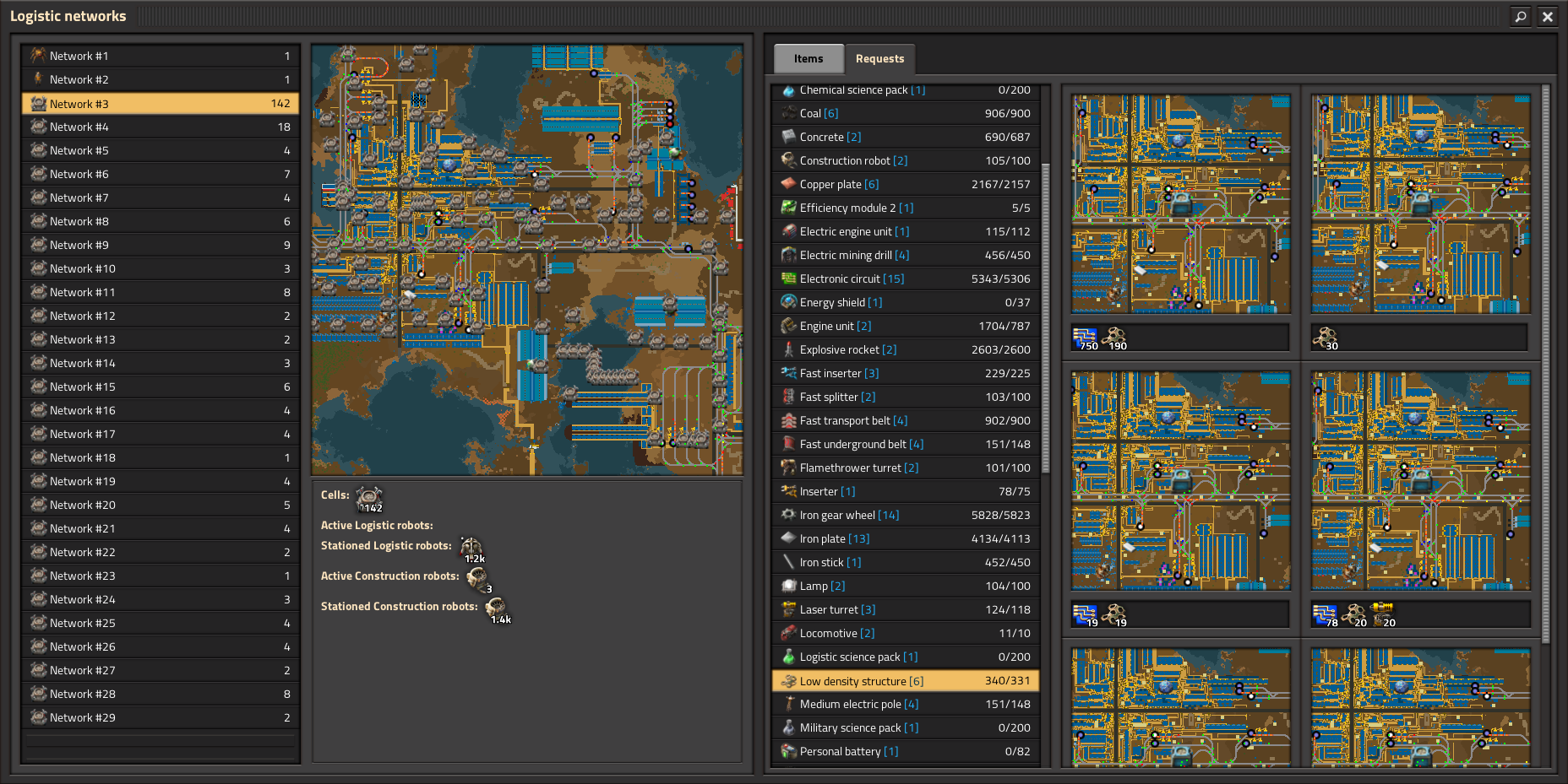
So there is an obvious improvement, we move the items to the side. This gives us more height, which means we can make the minimap square and bigger.
The second improvement came from an insight from using the last GUI, the number of 'Members' is generally pretty small, 5-10 at most. So the members tab was often really empty looking when compared to how much space the items tab reserved. So then there isn't really much point in having them in tabs. We can just always show both, because it is really unlikely that the Members will become too big for us to handle nicely.
The rest of the GUI cleaned up pretty nicely from here.
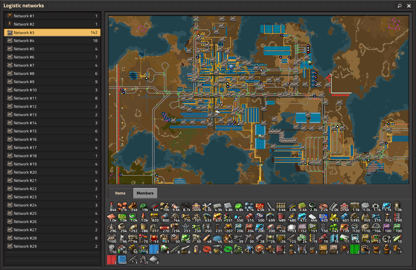
Since we have this big beautiful map in our face, it only makes sense to have the selection interaction work with the minimap. Another nice small feature we added was the ability to rename logistic networks, so you can keep track of things in your own ways.
However the GUI still had a problem, in that it was a 'Real GUI', it covered the whole screen and the minimap didn't allow any of the normal map interaction.
So the final change, was to rework the Logistic networks GUI to be a 'glued-on' remote view panel. This allows us to keep all the normal GUIs such as quickbar and inventory visible, allow you to build and modify things normally, and the Logistic GUI provides the logistic information.

With this, we reach the current state of the New Logistics GUI. Can you think of any other improvements we can make to it?
As always, skip the animations and launch your thoughts to us at the usual places.