Hello,
As the 2.0 release approaches, we have been spending time polishing and resolving things which we found during our playtesting.
It is the same old story... A feature we've wanted for a long time but was never high enough on the priority list. With more types of resources, it became a little bit more important to have a way to find resources on the map view, and with the new chart search (FFF-400), it was finally time to put it into place.
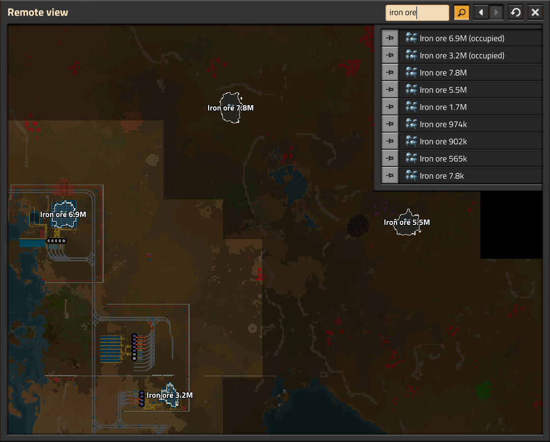
It took some care to make it work in a performance friendly way. The game doesn't keep track of all the generated ores as there are just too many of them, so the search needs to check every charted chunk to find them all. We run the search in a separate thread and only populate the final result when its ready, this way searching a large map won't introduce any stutter.
We also added the ability to pin the resource patch, and the count of remaining ore will update as the patch is mined. You can use this to keep an eye on how things are going, and be aware when a patch is running dry.
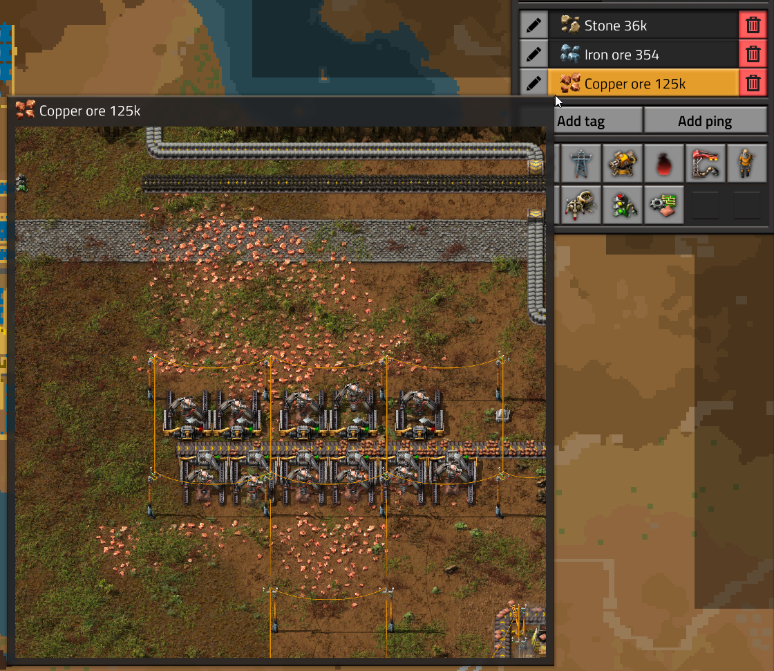
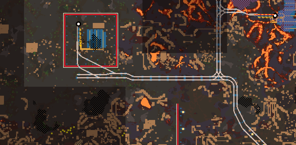
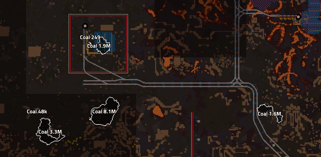
The search also helps solve another issue, which is that depending on the combination of resource and terrain color, the resources can be difficult to spot.
For example, some of us had a problem finding coal on the darker Vulcanus biomes.
The resource search helps to solve this as the highlight is very prominent.
Its always been a bit of a debate as to how many tools we should give to the player. When it comes to working out throughput and ratios, we preferred to leave more for the players to calculate. Personally I quite like the process of looking at a recipe, doing a bit of analysis to work out how I will want to build things, considering what type of belts and modules I have on hand.
In the base game it is fine, as the numbers are normally nice and round. But in Space Age, it would become a mess accounting for:
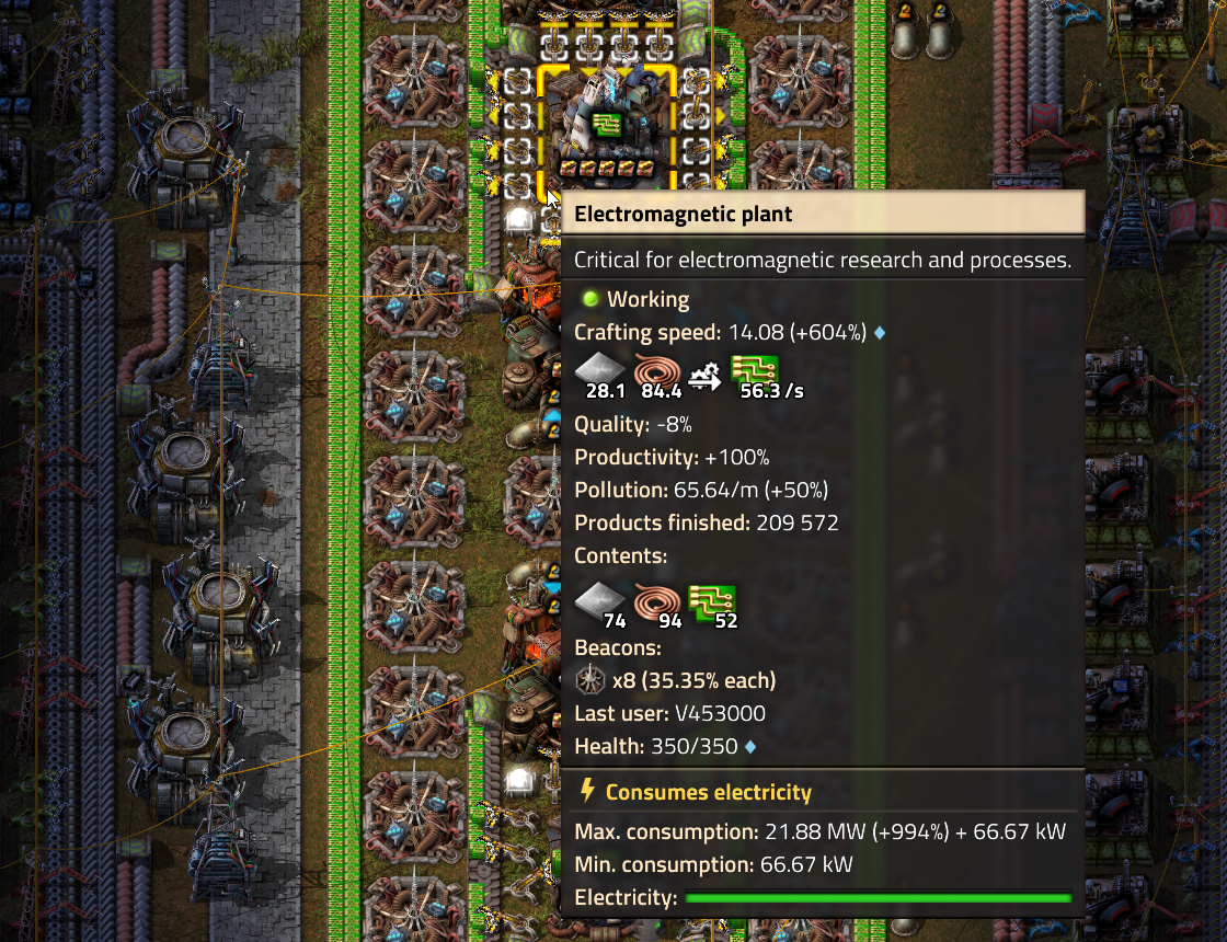
Not to mention we have a lot of new recipes which players will be unfamiliar with. These factors pushed us over the edge to finally add some information to the crafting machine tooltip, to show what the machine will actually produce:
The look of the assembling machine GUI has been relatively untouched for a long time. With Space Age, new mechanics often mean new considerations, and the assembler GUI is no exception.
The assembling machine product output slots show the recipe information as the tooltip. This is nice and has worked well, but we uncovered some issues:
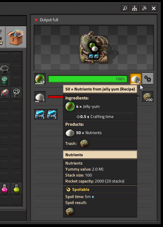
We can't see how spoiled the nutrients are.
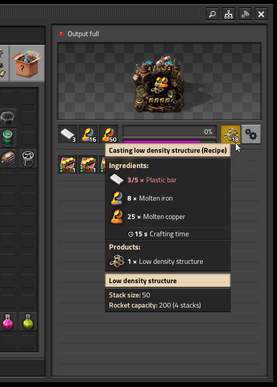
Alt-clicking this slot will just open 'Low density structure'.
So we've split the recipe information from the slot, which makes things more straightforward.
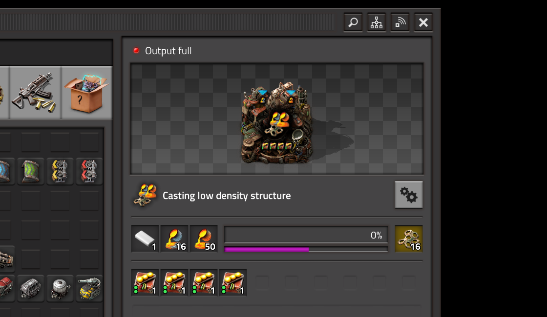
This means we can clearly separate where we are concerned with the recipe and where we are concerned with a specific item:
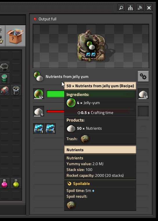
Recipe info shows recipe tooltip.
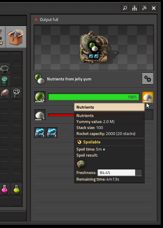
Product slot shows item tooltip.
This also helps actually show the name of the recipe if you're unfamiliar with it, as before all you had to go on was the recipe icon.
As always, search for some resources at the usual places.