Hello, as we learned countless time before: Visual feedback is the king! Especially when the GUI is as complex as the Train GUI.
The biggest missing feedback I could identify in the Train UI is not seeing the path the train is going to take, so it was the first thing we did:
Adding a station by selecting it from the list of the stations is nice and all, but being able to interact with the minimap directly is an opportunity that would be a shame to miss, so we added the possibility to shift-click a station to add it to the schedule. Since visual feedback is the king, holding shift shows the path to the selected station, so you have an idea how is the train going to get there. The train can take a different path in the end, as there are multiple possible paths to the same destination, but in general this works well.
The same goes for temporary stations, holding Control (the default modifier to add temporary stations) shows the path to that point. This can be also used to figure out problems in the rail network, as moving the mouse can help you to find out what section is blocked out because of bad signaling, missing rails etc.
But once we allow any interaction with the map, the map needs be useful, so we allow to move and zoom the map the same way as the normal game map. The view is centered on the current locomotive by default, but once you start dragging, the link is cancelled, and you can move wherever you like. Pressing the button will center it again.
As you might know, if the train has stations that are not available, the train skips them. But the reasons for it might be different, and it might not be that clear what is going on, so we decided to indicate the station state in the GUI, and give the player tooltip based info on why is the station is disabled.


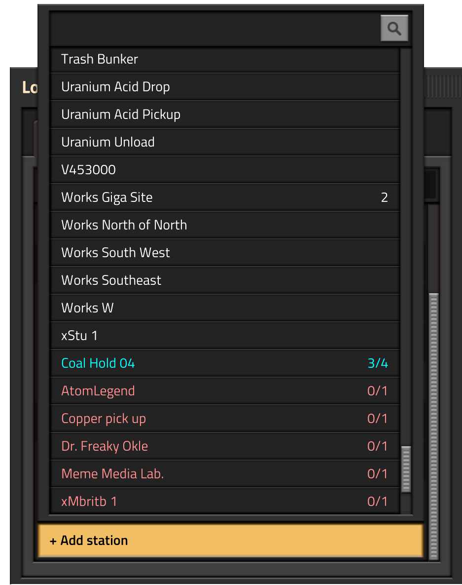
When you have multiple stations with the same name, we show how many there are next to the name in the station selection window. It can happen, that a station is not available from the current train location. Reasons can vary. The stop could be in different train system, there might be a bad signal, rail problem somewhere etc. So we show the inaccessible train stops with a red color, and put them at the bottom of the list. We even have special feedback for stations being partially accessible, IE when not all of the stations with the given name are accessible.

It is a small thing, but an example of what we learned in the settings GUI. Hovering the button to remove a condition works normally, but hovering the button to remove the whole station also highlights the buttons to remove the related conditions, as they are removed along with them.
One of the most common ideas from last weeks discussion thread was some visualisation of the AND/OR condition precedence, which was quite easy to do. When you don't have a complex condition, such as a simple 'Time elapsed AND Inactivity', the visualisation won't show. Only when you have a combination of 'AND' and 'OR' conditions, will the precedence be shown.
The last thing is not really GUI related, but rather a change of the train behaviour. We were asked many times, to support waypoints. A waypoint would be a stop in the schedule, where the train doesn't even stop, it just goes through it. Instead of having another checkbox settings on every stop for that, we just changed the rule, that no conditions on a stop means, that the train doesn't stop at all.
If you want a Train to come to a full stop and then continue, you can add a 'Wait 0 seconds' condition.
Implementation wise, the implications of this for the train pathfinding logic weren't that straightforward. Previously, each train pathfinding is done from its current position, to the next stop where it stops. But now, since the train might want to continue through the next stop at full speed, it needs to plan the path ahead through the next stop once it gets to the point of no return (the point where it needs to start braking to stop in time).
This means, that the train pathing can be ahead of the current station target by many stops, and since the schedule works circularly, it can plan through the whole schedule 2 or more times.
The fact, that all these things are finished now means, that the Train GUI chapter is closed and we can move on. There are a few nice ideas of what could be done to make the train schedule way more powerful in the endgame (Train names, Train groups, conditional stations), but this will have to wait until some future time. I believe, that this was the most complex UI we have done for 0.17, so it should only get easier from here on out :).
Related to the new quickbar, we had this idea of an easier way to access some game tools, especially blueprinting tools. This is how the Tool Bar came along.

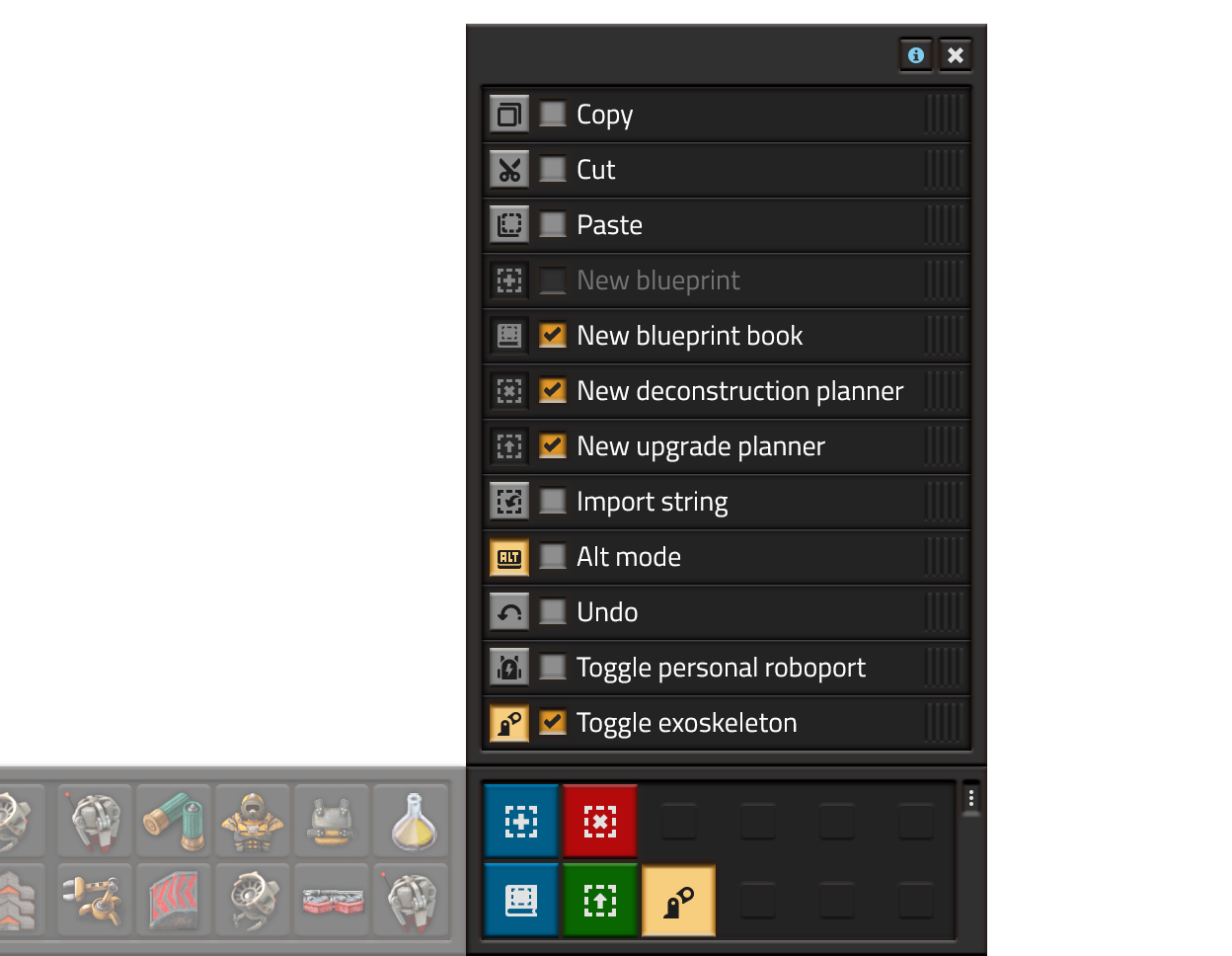
The tool bar is a small section to the right of the quickbar that contains a customizable set of buttons for some commonly used actions or tools (or actions/tools that don't belong anywhere else). You can see the tools we have far in the image below.

The Tool bar has 2 sections: the main panel and the tool selection list. The list contains all the possible tools and allows you to pin them to the main panel, sort them, or use them directly. Pinned tools are visible on the main screen all the time for ease of use. The main panel will change its size to accommodate for the selected tools. If no tools are selected, the main panel minimizes itself into a small button that opens the tool selection list.
All the tools related to blueprints were removed from the blueprint library and moved to the toolbar. Also they work a bit differently: when pressing "new deconstruction planner" for example, you will get a deconstruction planner that you can use immediately, and pressing Q will not place it in the inventory, instead it will place it back "into the button". This allows you to quickly deconstruct something without having to carry a "default" deconstruction planner around. Also avoids the situation where you end up with a bunch of different deconstruction planners in the inventory. You can of course still keep the deconstruction planner by explicitly clicking it in the inventory, quickbar, blueprint library, or any other inventory, such as a chest. The same behavior applies to the upgrade planner and empty blueprints.
Some tools will display useful information in the tooltips, for example: Paste will show a blueprint tooltip of the blueprint in the clipboard. Special shortcuts will allow you to navigate through the "clipboard history". Undo will show a textual representation (possibly also a visual representation) of what will be undone. Such as "Undo construction of Transport Belt", "Undo construction of 35 entities and 250 tiles".
Each tool will have it's own keyboard shortcut, so the tool bar will also teach players about these shortcuts through tooltips, hopefully to the point where they no longer need the tool bar.
Mods will be able to add their own tools to the list, making it a nice place for players to access mod-created tools.
Let us know what other quick tools would you like to see added to that list, or any other thoughts on our forum.