The release plan (kovarex) This week was the time to close and finish all the things that will go to 0.17.0. Not all of the things that we originally planned to be done were done (surprise), but we just left any non-essential stuff for later so we won't postpone the release any further. The plan is, that next week will be dedicated to the office playtesting and bugfixing. Many would argue, that we could just release instantly and let the players find the bugs for us, but we want to fix the most obvious problems in-house to avoid too many duplicate bug reports and chaos after the release. Also, some potential bugs, like save corruptions, are much more easily worked on in-house. If the playtesting goes well, we will let you know next Friday, and if it is the case, we will aim to release the week starting 25th February.
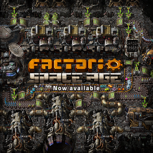
Factorio: Space Age continues the player's journey after launching rockets into space. Discover new worlds with unique challenges, exploit their novel resources for advanced technological gains, and manage your fleet of interplanetary space platforms. For more information about what comes with the expansion, check out our Space Age content page.
Hello, Today we want to share some exciting news!

Click to view full resolution It has been 6 months and nearly 70 releases since we first launched 0.17 to the world. Now is the time to let it be enjoyed by all the players of the game. We are going to be continuing our work on 0.17 over the next few months, with small experimental releases of new features, and finishing all the GUI reworks.
Ok→Cancel versus Cancel→Ok (kovarex) A really strange debate started as a continuation of FFF-238. I insisted that the button order should obviously always be OK Cancel, as in any UI I see around. But little I knew, that this is actually specific to windows, and on Linux or macOS, the order is reversed: Eventually, we figured out, that we are not the first one trying to solve the problem. The solution we are now experimenting it sounds like a bad idea: "Make it so much different and Factorio specific, that the way it is done in your specific system will not interfere with your muscle memory". Which brings me to the load game dialog mockup:
Hey guys, here comes the weekly dose of Factorio-world information for you. We have crafted it just before we leave for a gdsession warm-up party. Gdsession is quite a big game development conference here in Prague. This is the first year we are going to participate. And actually tonight we will have a short (10 minutes) talk about what we do (well, about Factorio obviously).
The new GUI tileset (Albert) The process of the GUI re-design is moving slowly but steadily. By making new mockups, re-thinking old mechanics, and with the proper feedback from a different range of people, the parts are falling into place. I'm starting to feel very confident with the actual general contrast and font sizes. Also the conversion from high resolution to normal resolution is working just fine. These subjects are very important to move forward with. Below you can see a demo of the current state of the new GUI. Not all the widgets are shown yet, but this document is helping us a lot in order to define the future elements. Seeing the big picture makes it much easier to tweak them altogether with a better coherence and consistency, not to mention for testing any kind of font, specifically non-latin characters sets, a subject that I personally have not paid too much attention to yet. This document is being used also to create the general tileset and see how it behaves in the engine. This is a work in progress, and we are tweaking details constantly. Many things will change during the process. Overall here you can see a sneak peek of the Factorio GUI to come. I want to also mention that we are actually taking care of the 8% of the population who has some sort of color vision problems. This subject is still very new for us, but we are without a doubt researching solutions to different conditions.
Color correction Albert, V453000 Factorio is in a state that even though is not yet finished, it is very close to its 1.0 version. That means that most of the work is done and we are polishing the game in order to make it bright. That's what we've been doing for the past 2 weeks. Literally making it bright. Since years I wanted to do this post-production work. But I didn't dare to do it until most of the graphics were finished. I was afraid of breaking the consistency of the look and our production pipeline. Now it's different. There's only a couple of entities to re-design and some other stuff to do, but in general this missing details are not affecting the possibility of working in the post-production. Factorio is a dark game. I mean conceptually. All these things about industrializing a planet, polluting an entire world just for the sake of the factory, and killing all its inhabitants are not precisely happy concepts full of light. This old article could explain better my thoughts regarding this concept. But the look of the game was dark, too dark. So we cleaned it up without betraying its spirit. Like restoring an old painting. The difference can be subtle, but very effective. We added more light, and a little bit of color saturation. Adding these general changes to the entire sprites collection is not an easy task. Many sprites were badly affected by this general correction. V453000 was fixing individually the broken sprites and icons in order to keep the consistency with the new context. We took the chance to work on the terrain a bit further. Not only this color correction was applied, but the contrast and integration with other terrains was also improved. Also experimenting with the color of the trees, trying to achieve a more colorful feeling with the excuse of an alien planet. I have to say the Alien Biomes mod was opening my mind - a little - to experiment with the color a bit further. In order to break this general brown feeling, we added a more orange tonality to the sand biome. Here is where you can see the difference more. Going further to too saturated colors is dangerous, after all, the terrain is a background that should provide a good and comfortable contrast with the entities and the icons. Touching terrain colours means touching map colors also. We were very keen to keep the visibility of the map information and the similarity with the terrain. The result is a more vibrant look in the entire game. We tweaked the night also. Thanks to posila and Wheybags, we can use LUTs (Look up tables) to dynamically modify the colors. Instead of playing with the alpha channel of a solid black layer on top of the game. Now we can gradually move to a different color palette for night with more control. So the colors are losing their saturation and becoming more blue and cold. This is important, because part of the annoying darkness of the game comes from this black layer. We are still experimenting with this LUT, and the transitions of day/night cycles. I'm pretty sure also that I will have to touch the map colors for some missing details and fine tuning. Possibly there is some entity that is not in its best shape with these new color palettes, and maybe we keep tweaking the terrain. But I feel very confident with these additions and I'm very sure that these changes will improve the experience of playing Factorio. After playing with these colors, the feeling is good. I hope you see it the same way.

Offshore pump redesign V453000, Albert As one of the last entities which do not have high resolution graphics, the time has come for the offshore pump. The offshore pump is practically a 1-tile entity, but they must have a 1 tile gap between each other. It is also the only entity placed on a water tile at the moment. When we changed the way how terrain to water transitions work, we moved the offshore pump to be placed on the water tile. This can result in the pump drawing over terrain in ugly ways. With the redesign, we took the oppourtunity to move the offshore back onto land, and additionally the pump checks a 2x3 tile water area in order to be buildable. The new placement rules only applies to newly built pumps. Offshore pumps on existing maps will keep functioning, they’ll just be shifted out from the shore. There is no blue colour for water integration at the tip of the offshore pump, so the offshore pump will look correct even with unexpected water types (not a big problem in vanilla). The water integration is split to an underwater layer which does not show when the pump gets landfilled over. In the basic concept, the offshore pump is another type of a pump, so it should be similar to the other pump entity Albert made a few years ago, including the animation and visible fluid in it. The obvious difference is the connection to water. However we felt that is not different enough and needs more visual balance, so we added a pair of supportive legs. We are planning to release the new offshore pump graphics with the next release, likely next week.