Hello, 0.12 will be stable soon, so is a good time to start making you want things from 0.13 right? :)
In FFF-241 we discussed how the game delivers information to the player in a number of confused ways; Blinking arrows and circles, chat messages on the bottom left corner of the screen, objectives in the top left, orange modal boxes bubbles on top of the player, and so on. These problems are exacerbated on high resolution monitors, where the information becomes even further spread apart. We have tried a few ways to unify this information, but much of it was required to be in the world space, or needed to have a link between the screen space and the world space. The common solution to this is to have the GUI 'point' to an entity in the game world, but we wanted something more interesting.


As stated in previous FFF's we will be making some changes to the demo and tutorial content in the game. I wanted to clarify exactly what is being removed and what it is being replaced with, as this content is almost ready for release. If you would like to catch up on the topic, you can read Kovarex's piece in FFF-327, but I will also summarize it here. Right now the NPE/Introduction is the scenario that is used as the demo (0.17) and as the tutorial in the full game (0.17 stable, 0.18 experimental). If anyone has played the tutorial in the last 12 months, this is probably what you have played. The First steps campaign was a series of three levels which used to make up the demo and tutorial in 0.16 and earlier. They were introduced in 2014. We have been working on revamping these levels to bring them up to 0.18 standards. Very soon the NPE/Introduction will be removed and the First Steps campaign will be reinstated, both as the full game tutorial and the demo.
We've been updating, reworking and redesigning many graphics, and the majority of entities have had high resolution for a while now. With 1.0 we're trying to be as "complete" as feasible.

Hello, The year is wrapping up, and we have been hard at work finishing off some topics before we take our Christmas break. As you can imagine, releasing any new version of the game without a few weeks to do bugfixing wouldn't be wise, so you can rest easy this holiday period without the worry of a surprise 0.18 release.
Hello, Today we want to share some exciting news!
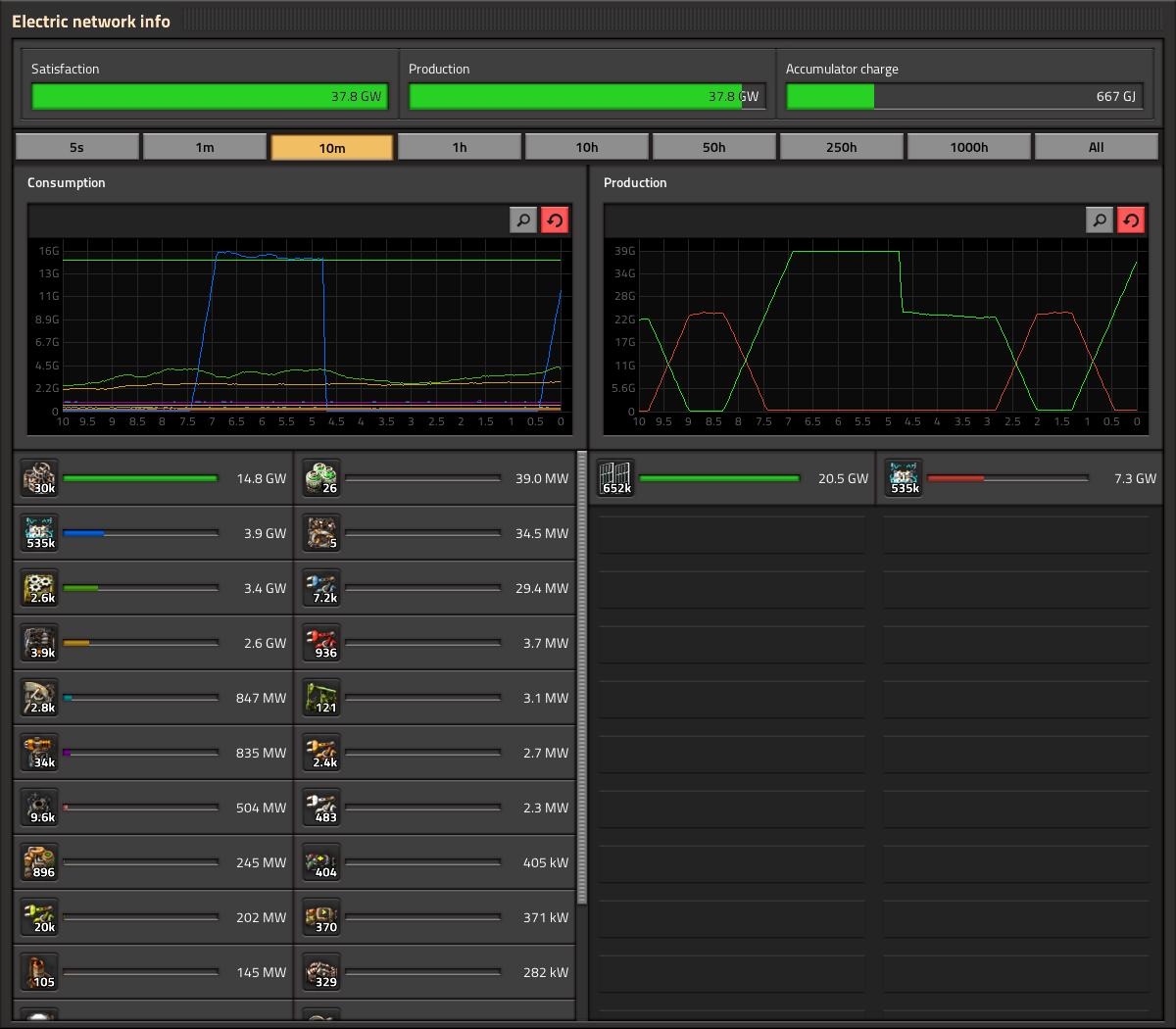
Statistics GUI Klonan, Oxyd The statistics GUI (electric network stats, production stats, etc.) is one of the GUIs that has been in the game for a very long time, and has had its functionality fleshed out reasonably over the years. It was not long ago when Twinsen added hovering and highlighting to the graphs. Given that, and the relatively short timeframe for 1.0 release, the update of the statistics GUI has really just been a style update, no new features or heavy logic rewriting. Oxyd has most of the work done, so we are happy to show some real in-game screenshots of how it looks: A notable change with the electric stats is that the Satisfaction/Production/Accumulator charge are next to each other in a single row, as opposed to each in a separate row. The label for the exact amount has also been moved to inside of the progress bar, which itself is much thicker. The production stats are pretty much the same functionality wise. One new button you might spot is the search button. However there are some problems with the search feature. As you can see, production and consumption frames have a different search box independent from each other. The main problem is when pressing CTRL+F to perform a regular search: How do we know which frame to open? Of course this could lead to different solutions like the use of a cycle for the focus of the search, in which the second time you press CTRL+F the other frame gets the focus. Or both of the search boxes open at the same time but only one gets the focus. Or only one frame gets the focus and the other one works only by pressing the button. But let's face it, these "solutions" are not solid at all and create inconsistency in the main design. To solve this issue we decided that the simplest way to go is the use of just one search box on the header of the panel. This new location works as a general feature for the entire panel. One single search gives you 2 results, one on each frame. This solution is used in the new character window -to come soon- making it consistent with the whole design of the GUI. You can also see we took this opportunity to integrate the Kill statistics in with the rest, instead of being its own window with its own hotkey. The Statistics GUIs will need a few tweaks and polishings here and there before it is ready for release, but unless something unexpected happens you can expect it coming out in a release soon.
Hello, It is a busy time fixing bugs and cleaning up after the Space Age release.